
UX/UI | UX Visual | Visual Design | Art Direction | Creative Direction | Premium Brand Systems | eCommerce Experience Design | Campaign Experience Design | Web & Mobile Design | Prototyping | Cross-Functional Collaboration
Concept Evolution
Across the James Harden Vol. 1, Vol. 2, and Vol. 3 launches, I developed and refined a visual system that progressively deepened the relationship between product and athlete.
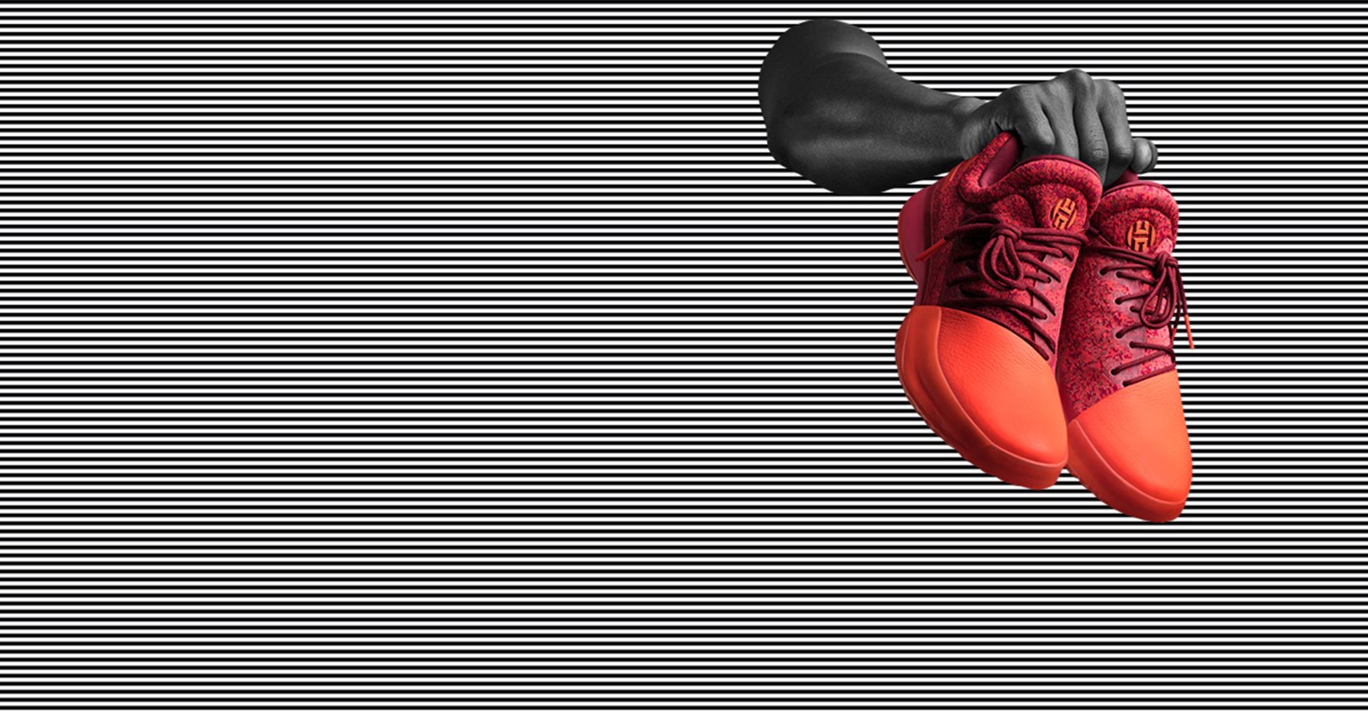
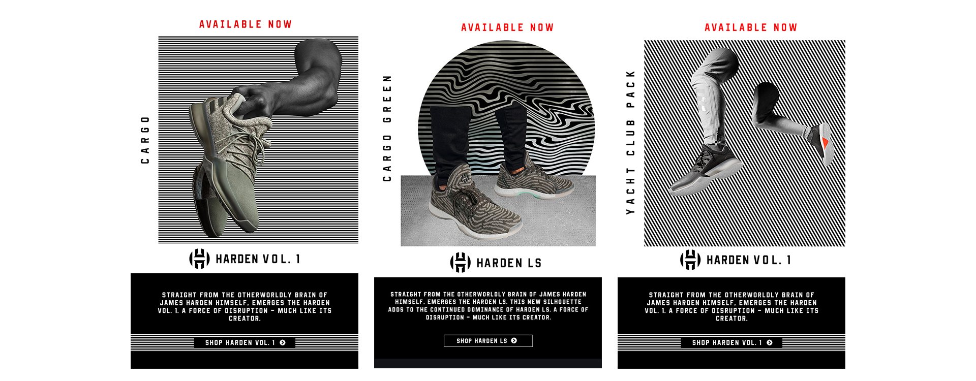
Vol. 1 — Product as Hero
The initial approach for Vol. 1 focused on product-first storytelling. The shoe was isolated as the primary subject, paired only with fragments of Harden - an arm, a leg, or a gesture - to suggest presence without distraction. This allowed the footwear’s form, materials, and color to command attention while subtly reinforcing the athlete connection.
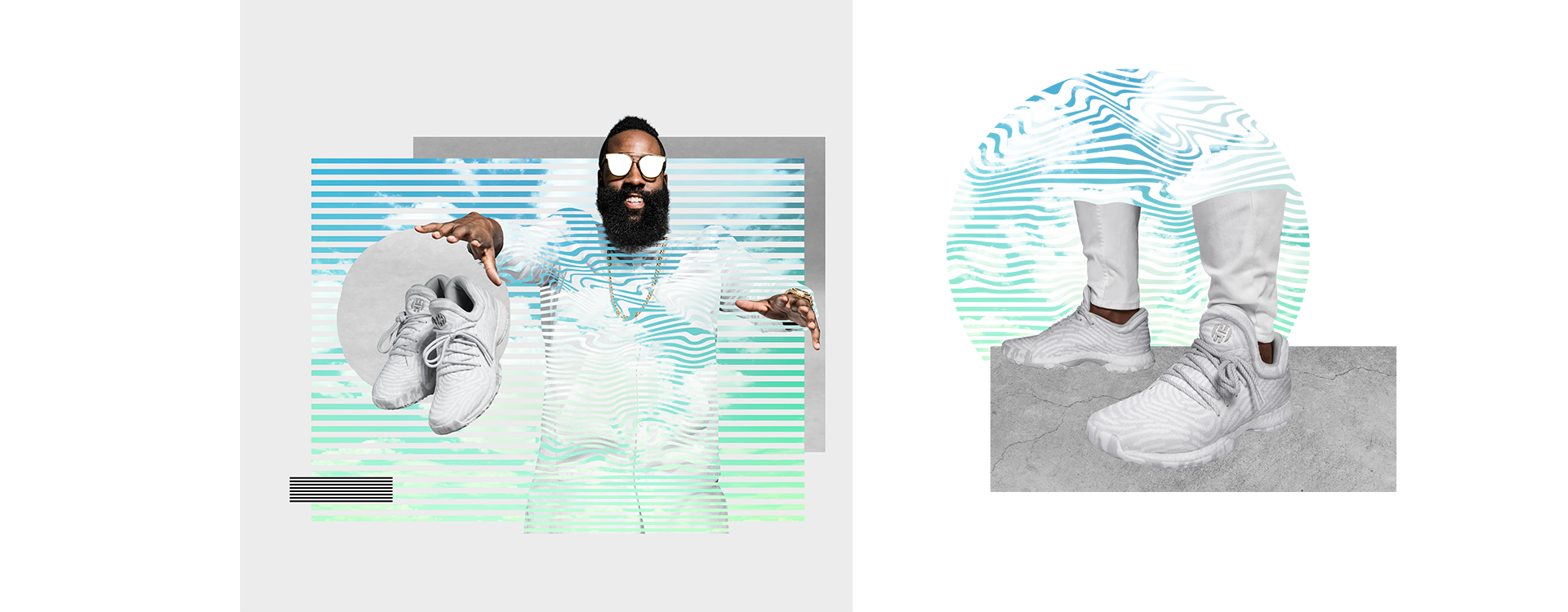
Vol. 2 & Vol. 3 — Product + Athlete Integration
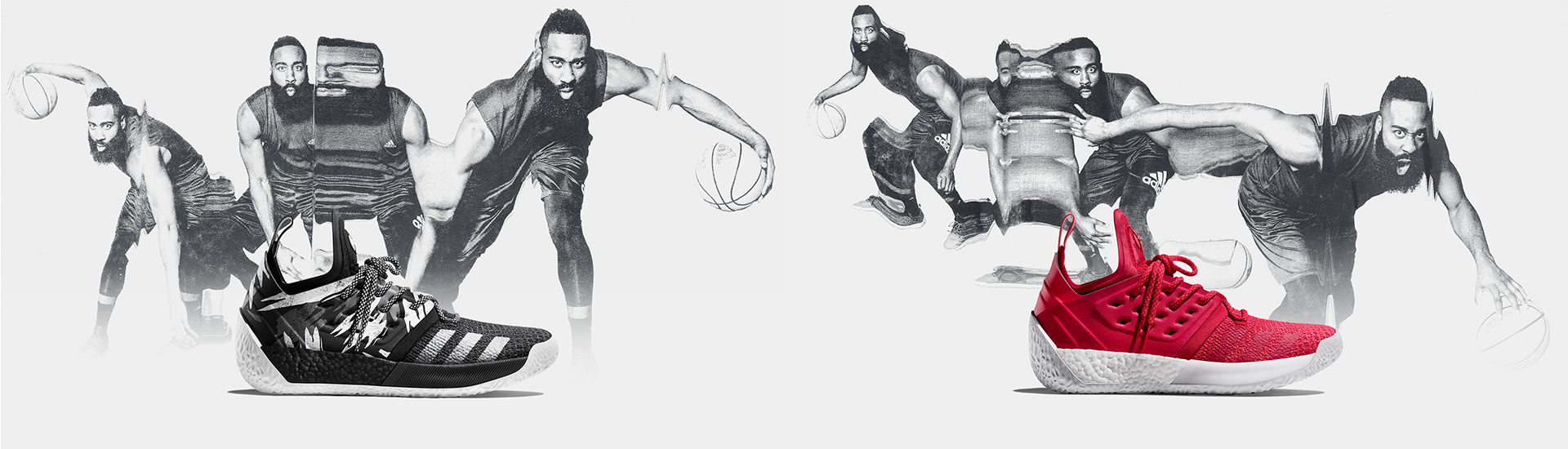
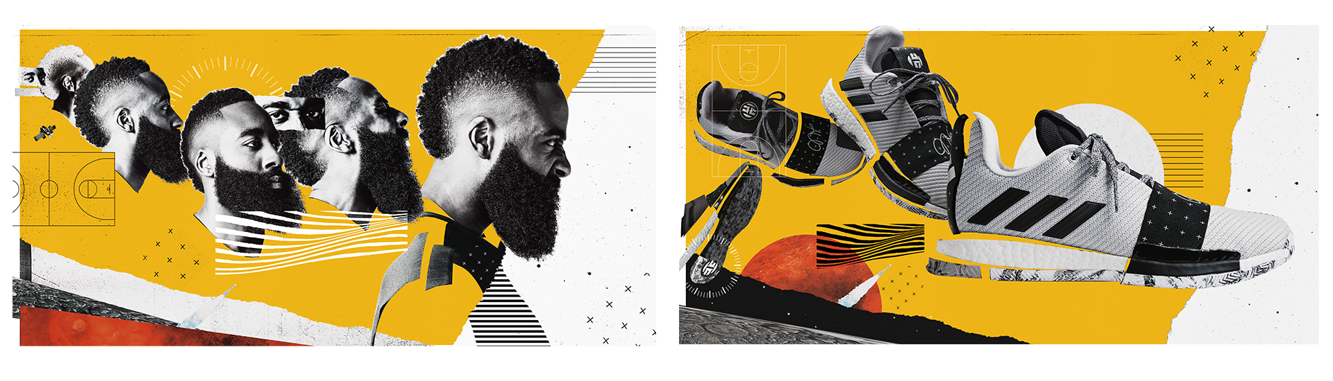
Building on that foundation, Vol. 2 and Vol. 3 evolved the system by introducing fuller athlete imagery behind the product. The shoe remained the focal point, positioned in front of Harden to preserve clarity, while the athlete imagery added personality, motion, and narrative context. This progression created a stronger emotional connection without compromising product readability.
Outcome
The result was a scalable, recognizable visual language that matured with the line — moving from minimal suggestion to full integration. The system balanced product precision and athlete identity, supporting launch moments across digital, social, and e-commerce surfaces while maintaining a consistent design philosophy across all three releases.