Founding Product Design | UX Research & Strategy | Marketplace UX | UI & Interaction Design | Rapid Prototyping | Design Systems
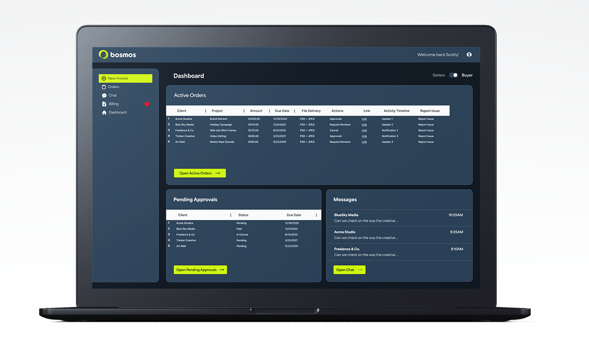
Bosmos began as a simple idea: help creators send clean, professional invoices - and help get paid quickly.
As the founding designer, I shaped the product from the ground up. I mapped early concepts into a structured system, designed the first flow for sending invoices, and expanded the platform into a full ecosystem supporting secure payments, protected transactions, messaging, and client management.
I built the design system, UI patterns, and product architecture that define today’s Bosmos experience and designed to be used on mobile and desktop seamlessly.
As the founding designer, I shaped the product from the ground up. I mapped early concepts into a structured system, designed the first flow for sending invoices, and expanded the platform into a full ecosystem supporting secure payments, protected transactions, messaging, and client management.
I built the design system, UI patterns, and product architecture that define today’s Bosmos experience and designed to be used on mobile and desktop seamlessly.
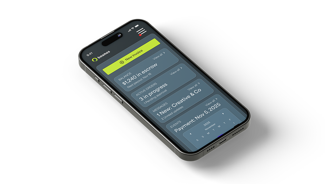
As the product evolved, designing the mobile experience became one of the most important parts of the project. Most creators send invoices, chat with clients, and check payments on the go... between shoots, at events, or in the middle of project work. Bosmos needed to feel fast, lightweight, and effortless on a small screen.
I re-thought every flow specifically for mobile: simplifying forms so they were easy to complete with one thumb, reducing friction in creating a new invoice, and making core actions - like previewing an invoice or checking payout status - instantly accessible to the user. Messaging and notifications were redesigned to feel like familiar, everyday mobile patterns while still fitting into Bosmos’ visual language.
Mobile also introduced the need for Seller ↔ Buyer mode switching in an intuitive way. I designed a bottom-sheet role switcher that keeps the UI clean while giving users clear control over their workspace. Onboarding, payments, contacts, and calendars were also re-architected into modular, mobile-first components that could scale over time.
The result is a mobile experience that mirrors the clarity of the desktop version but is optimized for creators who live and work on their phones -simple, fast, and focused on helping them send invoices and get paid with as little friction as possible.
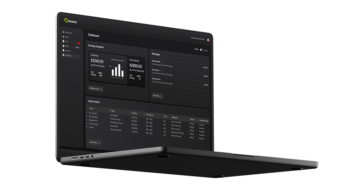
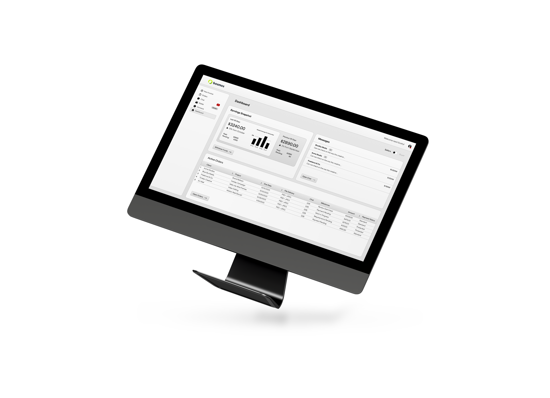
Designing the desktop experience for Bosmos was about creating a workspace that felt powerful, structured, and calm - something creators could rely on when managing their business. Unlike the mobile version, which prioritizes quick actions and on-the-go tasks, the desktop environment needed to support deeper work: creating invoices, reviewing orders, managing contacts, and checking analytics.
I approached the desktop layout with a focus on clarity and hierarchy. The left-side navigation became the backbone of the experience, giving users a consistent orientation no matter where they were in the product. Page structures were built on repeatable patterns: a top header for context, a content column for primary tasks, and a supplemental right column for summaries, tips, or upcoming actions when needed. These patterns helped create an interface that looked sophisticated but felt immediately usable.
Most of the heavy workflows - like editing an invoice, reviewing files, checking order milestones, or handling payouts - were intentionally expanded for larger screens. Tables offered sortable data with quick-access actions. Modal overlays provided room for reviewing messages or invoice previews without losing context. I spent time refining taxonomies and information architecture so that each section (Orders, Chat, Wallet + Contacts) felt logically connected and easy to traverse.
Because Bosmos supports both Seller and Buyer roles, I introduced a clear role-switching element in the desktop header. This helped users understand which “mode” they were viewing, avoiding confusion and giving them control over how they navigated the product.
The result is a desktop experience that feels like a professional hub: clean, organized, and designed for efficiency. It gives creators + clients the space to focus, plan, and manage their work with confidence.