
UX/UI | Product UX Design | Interaction Design | Information Architecture | Mobile Experience Design | Real-Time Data UX | Notification & Alert UX | Prototyping | Usability Testing | Cross-Functional Collaboration
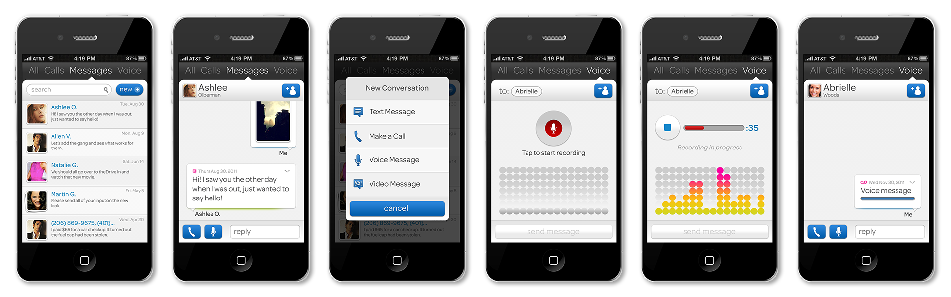
AT&T Mobile & Tablet Applications - Designing Before the Patterns Existed
This work was created at a moment when mobile applications and the iPhone were still new to the industry. Design systems, interaction standards, and platform conventions were not yet established. I worked on early mobile and tablet experiences for AT&T that helped define how users interact with apps on small, touch-based screens—patterns that are now commonplace across modern products.
The Challenge - Designing for an Emerging Medium
Mobile and tablet platforms were evolving rapidly, with new devices, screen sizes, and operating system behaviors emerging almost monthly. Users were still learning how touch interfaces worked, while teams were figuring out how to translate desktop and web concepts into intuitive, finger-driven interactions. The challenge was to design experiences that felt approachable, efficient, and learnable—without relying on established UX conventions or platform guidance.
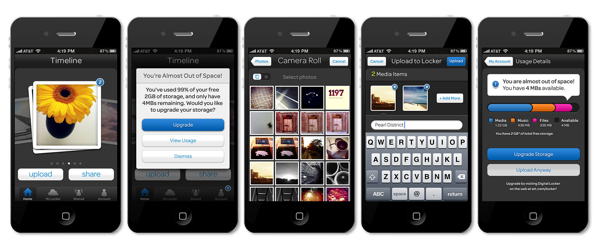
My Role - UX, Interaction, and Visual Design
I led the UX, interaction, and visual design for multiple mobile and tablet applications, focusing on:
- Defining interaction models for touch-based navigation
- Designing layouts that scaled across early phone and tablet form factors
- Establishing visual hierarchy and spacing for small screens
- Creating flows that reduced friction in task-based mobile experiences
- Producing high-fidelity designs and prototypes for implementation
This work required balancing experimentation with clarity - introducing new interaction ideas while ensuring usability for first-time smartphone users.
Approach - Inventing Everyday Patterns
Because common mobile patterns didn’t yet exist, much of the work involved testing assumptions and refining behaviors through iteration. I explored how gestures, taps, scrolling, and progressive disclosure could replace traditional navigation models. Layouts were designed to prioritize content clarity, thumb reach, and task efficiency, while visual systems reinforced hierarchy and state in an environment with limited screen real estate.
Design Solutions - Foundations of Modern Mobile UX
The resulting designs introduced:
- Early touch-first navigation patterns that emphasized simplicity and discoverability
- Modular layouts adaptable to both phones and tablets
- Clear visual hierarchy to guide users through multi-step flows
- Interaction feedback that reinforced user confidence in a new input paradigm
Many of these solutions align closely with interaction patterns that later became standard across iOS and Android platforms.
Collaboration & Delivery
I worked closely with engineering and product teams to ensure designs translated cleanly into build as mobile platforms evolved. Given the pace of change, designs needed to be flexible and forward-looking - anticipating OS updates, new device sizes, and shifting user expectations. Detailed specs and iterative handoff helped teams ship with confidence despite the lack of established precedent.
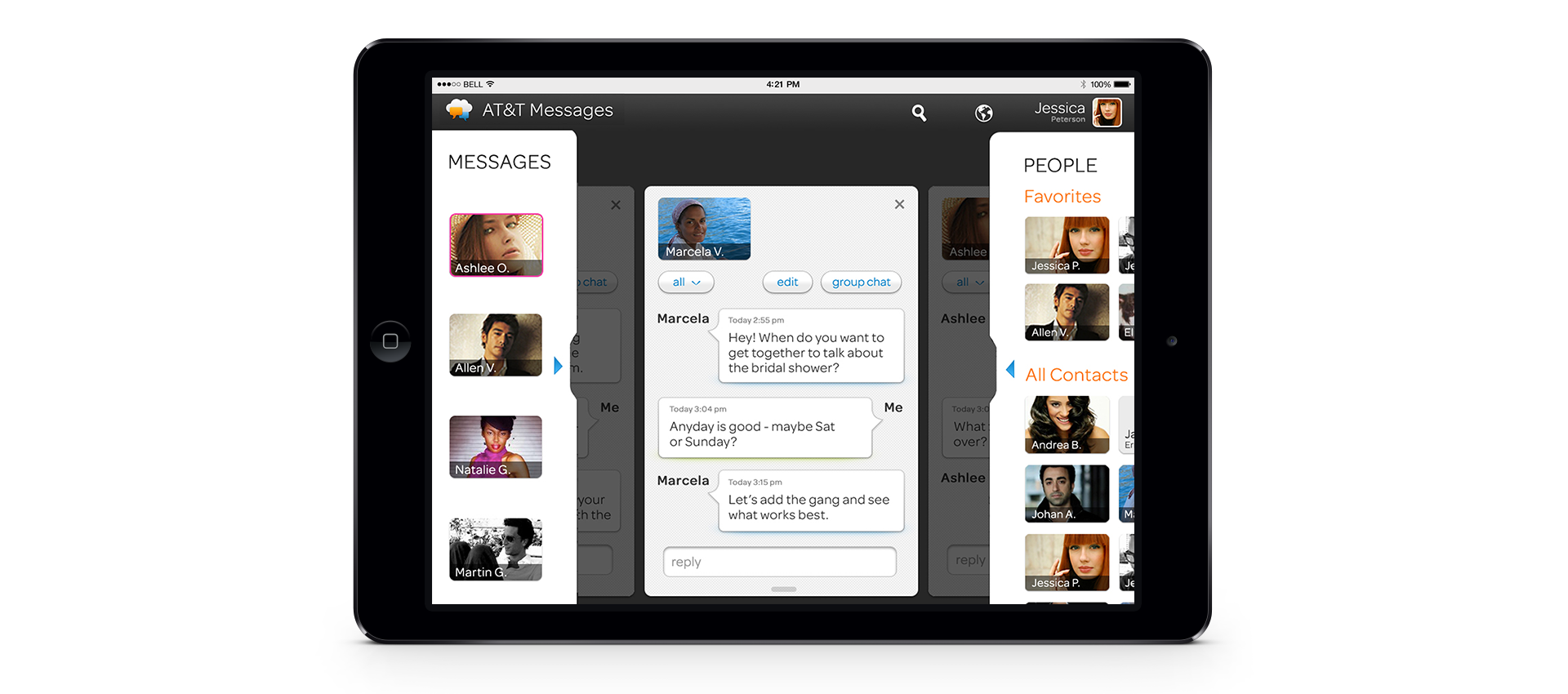
Impact - Designing What We Now Take for Granted
This work contributed to shaping how users interact with mobile applications today. At a time when mobile UX was still being defined, the designs emphasized clarity, responsiveness, and ease of use - principles that remain core to successful product design. The experience strengthened my ability to design in ambiguous, rapidly evolving environments and to create intuitive systems before formal standards exist.