
UX Visual | UX/UI | Accessibility (WCAG / 508) | Prototyping | User Research | User Interviews | Usability Testing | Data Visualization | Creative Direction | Icon Design | UX Copywriting | Secure Federal Clearance
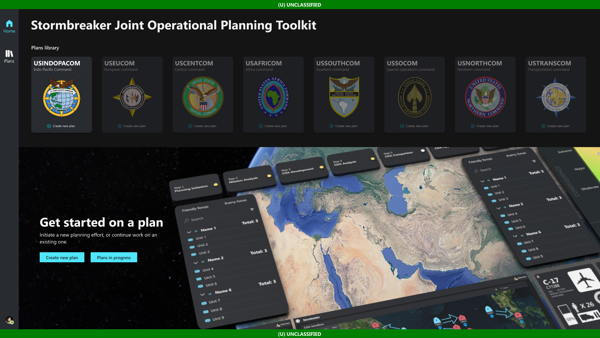
I was approached by Microsoft about multiple US Government/US Military jobs that dealt with saving lives, saving the taxpayer's money, and space... how could one say no? A small team that included another UX designer, a UX researcher, and a 3-D artist would embark on three dream jobs one could have in a lifetime.
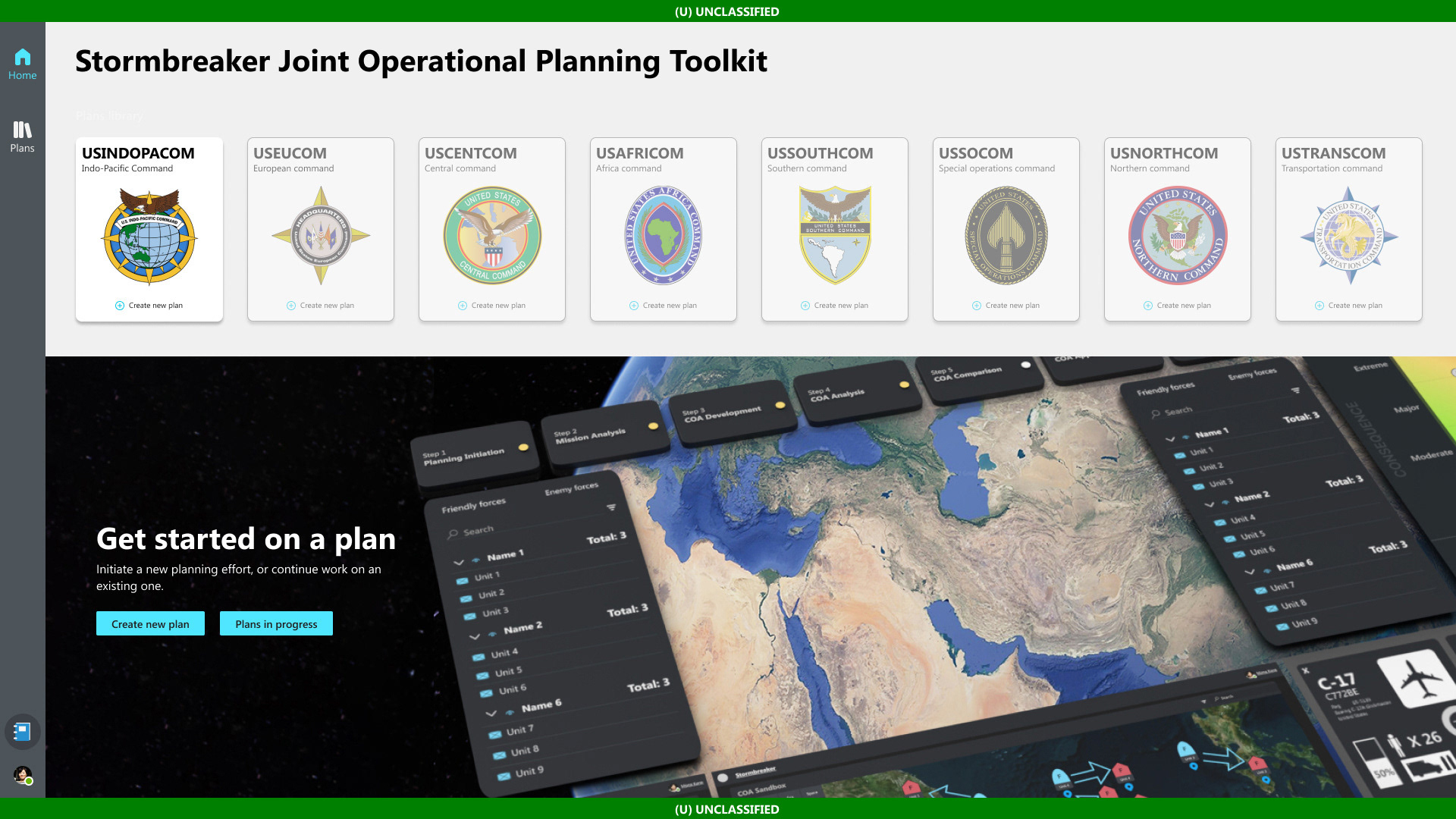
One of the projects was working with Subject Matter Experts from the US Military who help create COA's (Course of Action) which are plans that help protect our country and help keep allies safe.
One of the projects was working with Subject Matter Experts from the US Military who help create COA's (Course of Action) which are plans that help protect our country and help keep allies safe.
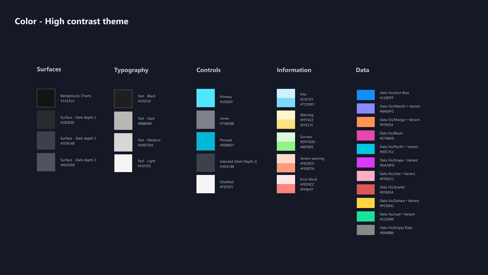
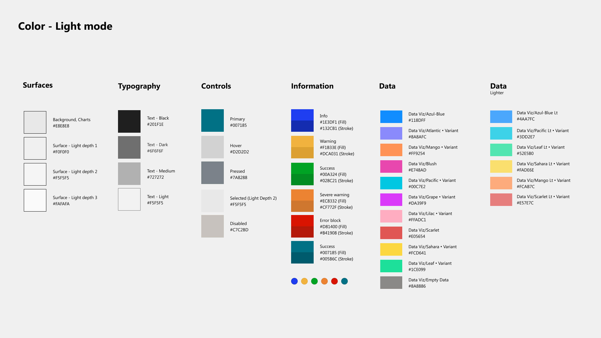
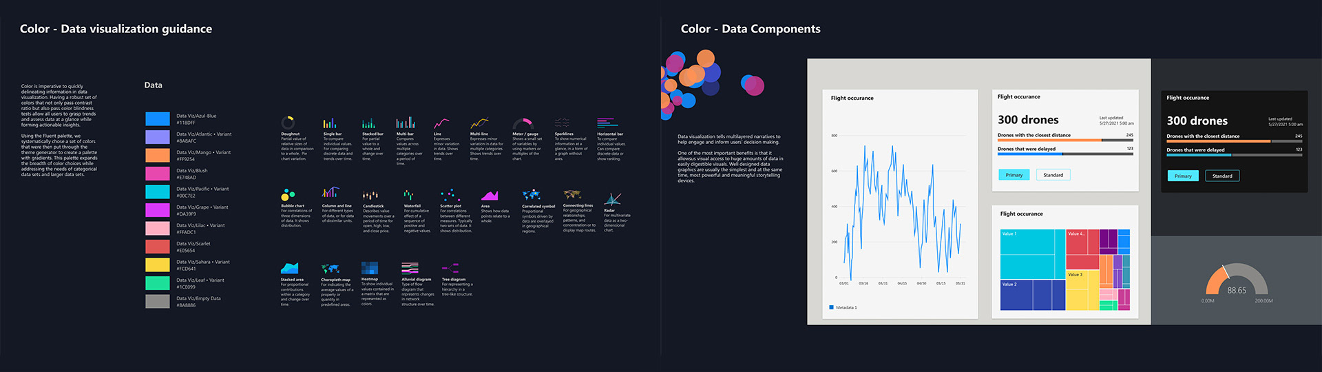
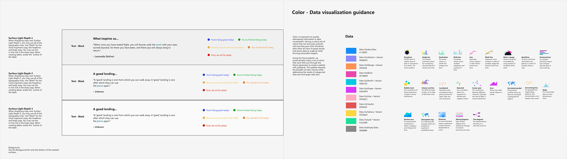
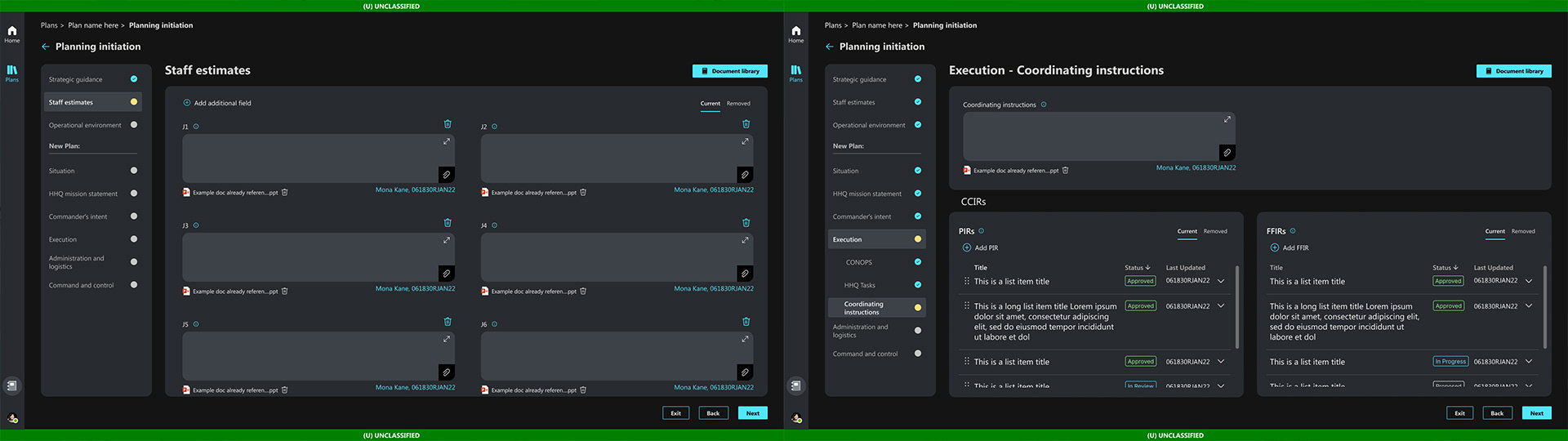
We initially established a high-contrast, dark-mode design system that tested well with younger COA developers. However, research and feedback from Subject Matter Experts - many of whom were accustomed to working in tools like Microsoft Word and Excel - revealed a strong preference for a more familiar visual environment. In response, I designed a complementary light-mode system, drawing inspiration from early Microsoft application color palettes. This approach improved comfort, readability, and adoption among SME users while preserving consistency and accessibility across the overall system.
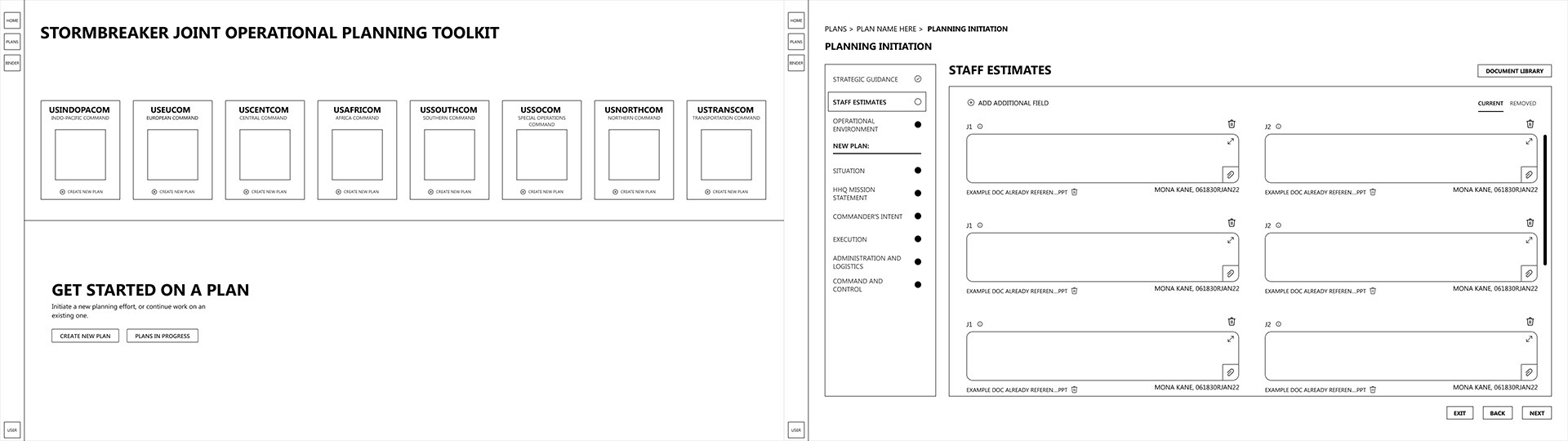
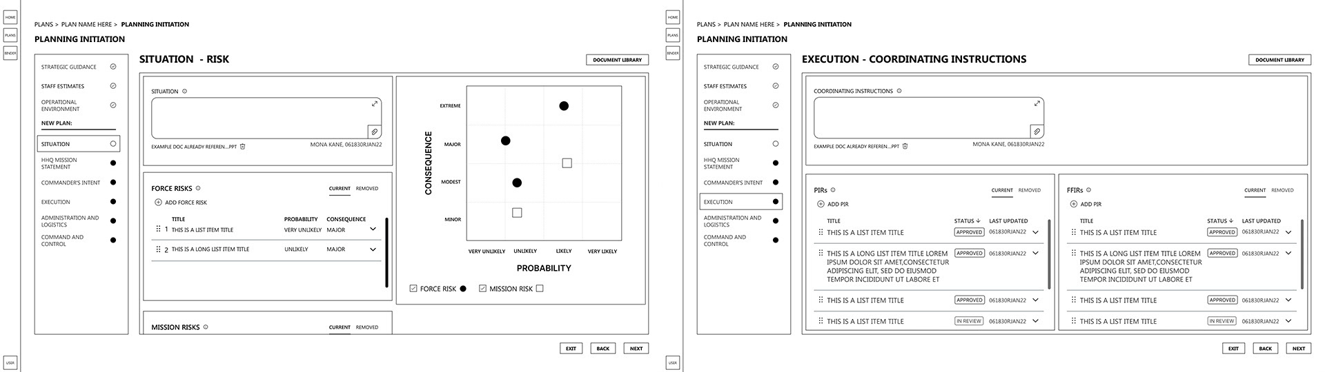
Stormbreaker was a mission-critical enterprise platform supporting highly complex, regulated workflows across the U.S. military. To bring clarity to this complexity, I led the creation of hundreds of wireframes spanning roles, permissions, data states, and operational scenarios.
Rather than treating wireframes as static artifacts, I used them as a system for thinking—mapping end-to-end workflows, edge cases, and decision points across the application. This level of rigor allowed cross-functional teams to align early, identify gaps before development, and ensure the product could scale without breaking under real-world operational demands.
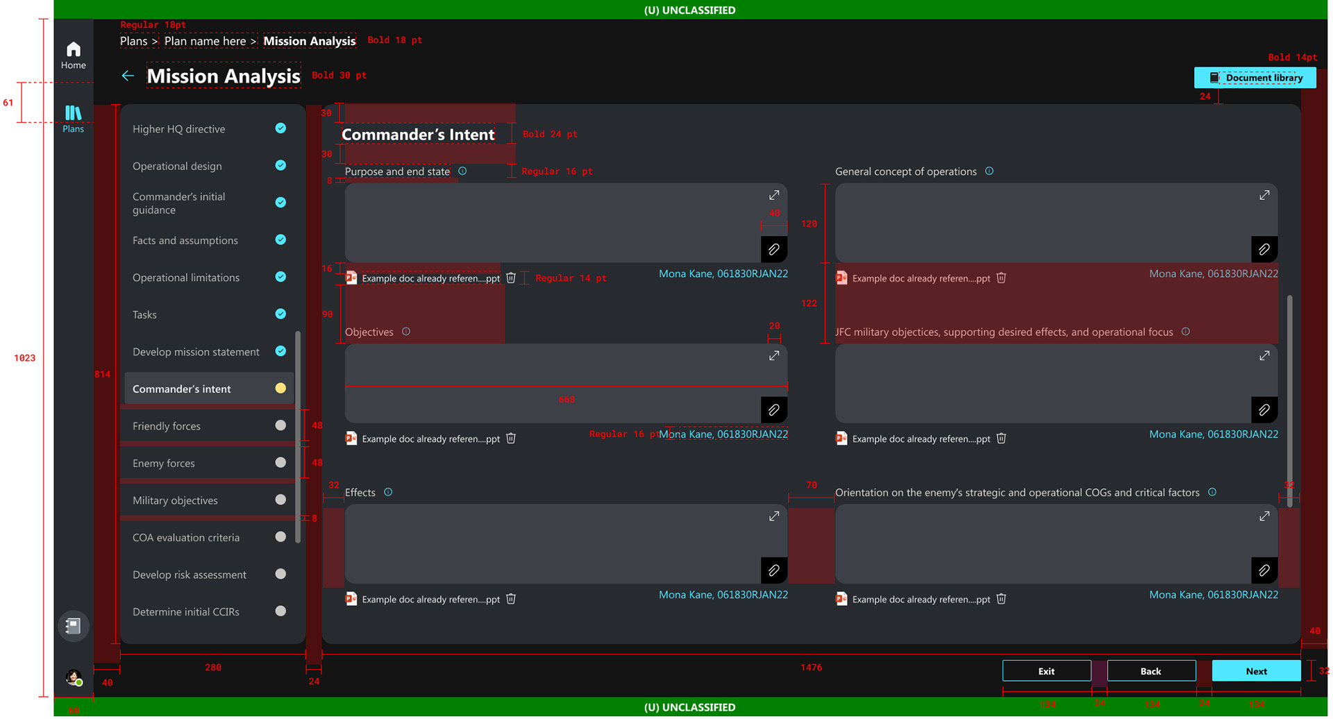
Given the system’s complexity and risk profile, each page required comprehensive redlining before development. This process ensured accuracy, consistency, and predictability during implementation.
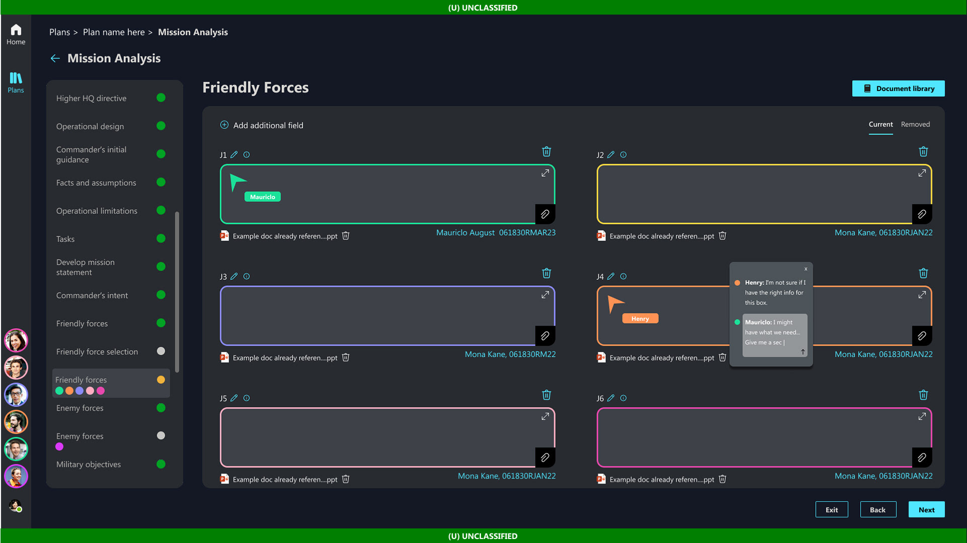
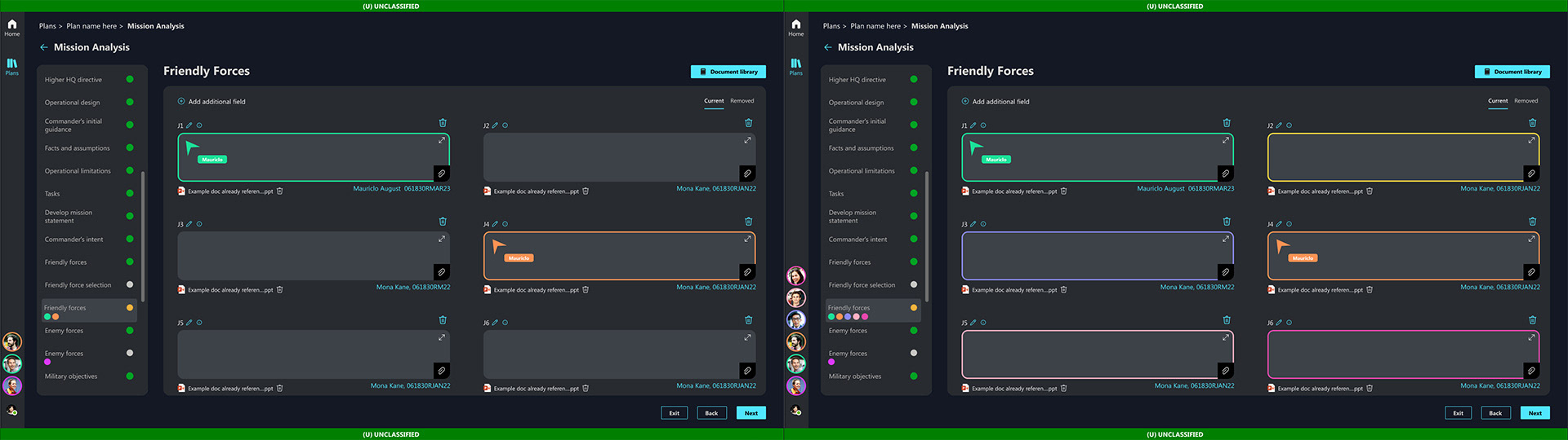
We explored a wide range of ideas through rapid iteration and user validation, testing each concept to determine whether it added meaningful value to the product. For example, in scenarios where multiple developers could be working within the same COA simultaneously, we evaluated features such as real-time presence indicators and in-app messaging to understand whether visibility into who was active - and where - would improve coordination or introduce unnecessary complexity.
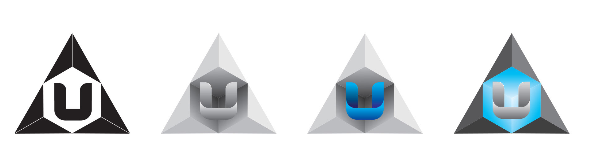
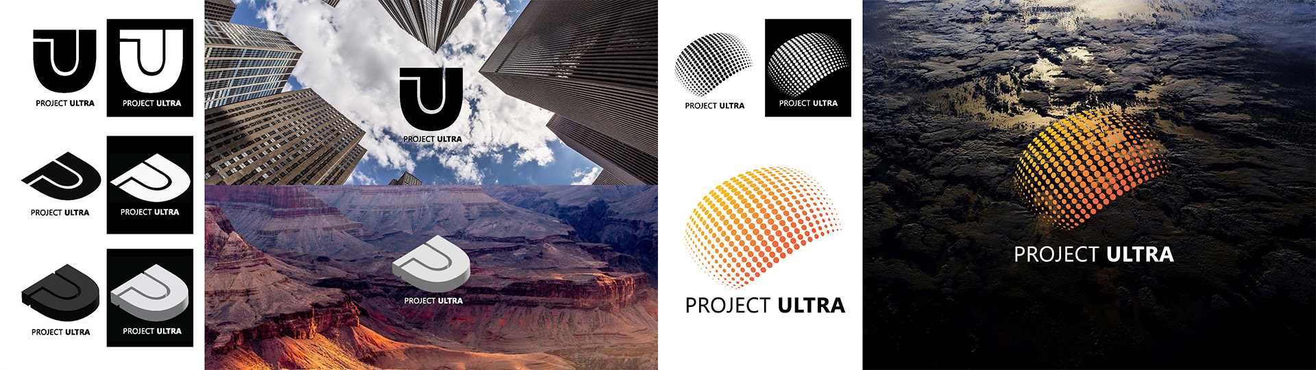
I was tasked with designing a logo that captured the project’s core attributes - modern, mission-ready, and aligned with the visual language of Microsoft without directly referencing it. After developing the initial mark for Project Ultra, the program was later renamed Stormbreaker, with the identity evolving alongside the product.
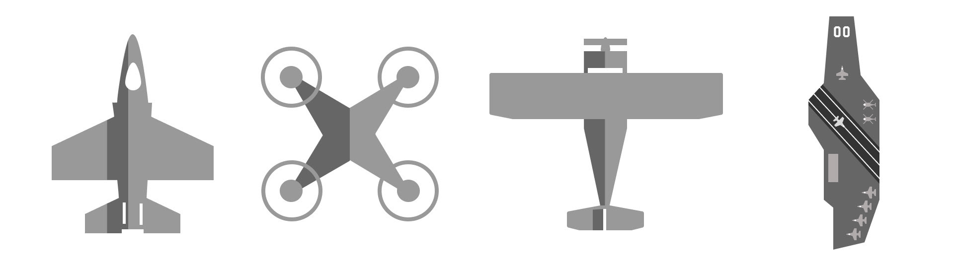
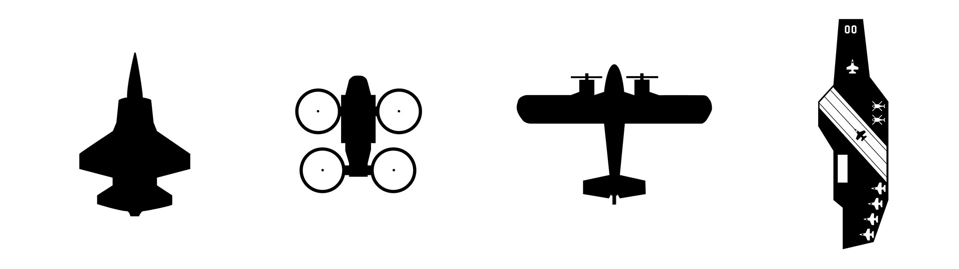
I designed a cohesive iconography set representing land, sea, and air vehicles, built in Figma as scalable SVG assets to ensure consistency, flexibility, and ease of implementation across the product.
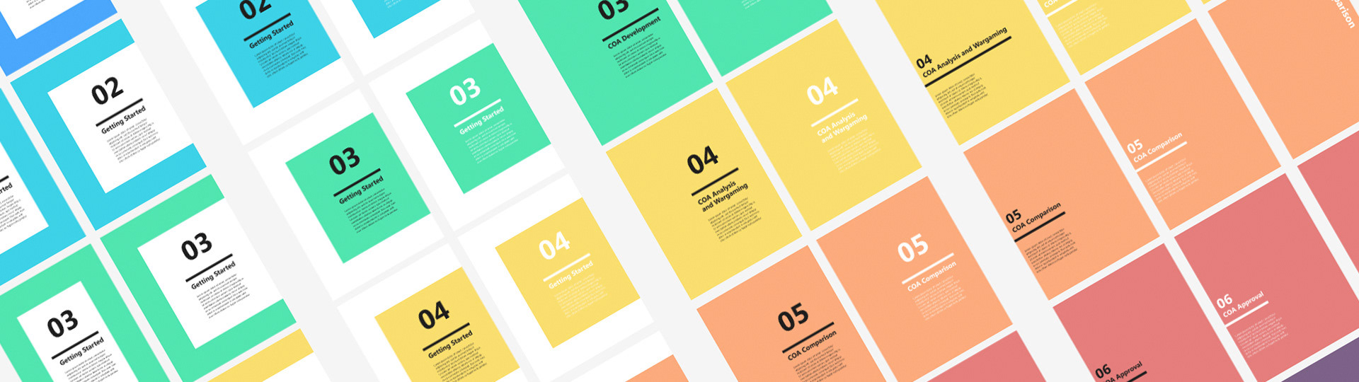
I designed in-app onboarding materials that combined instructional content with interactive examples, helping users quickly understand complex workflows without leaving the application.
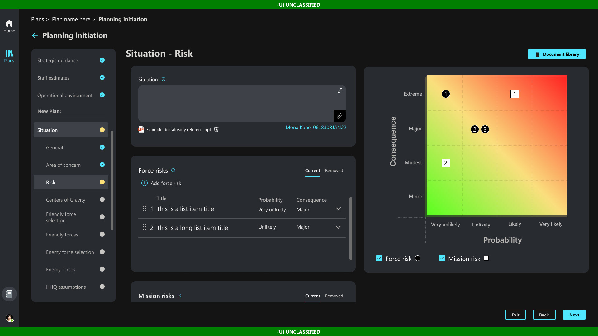
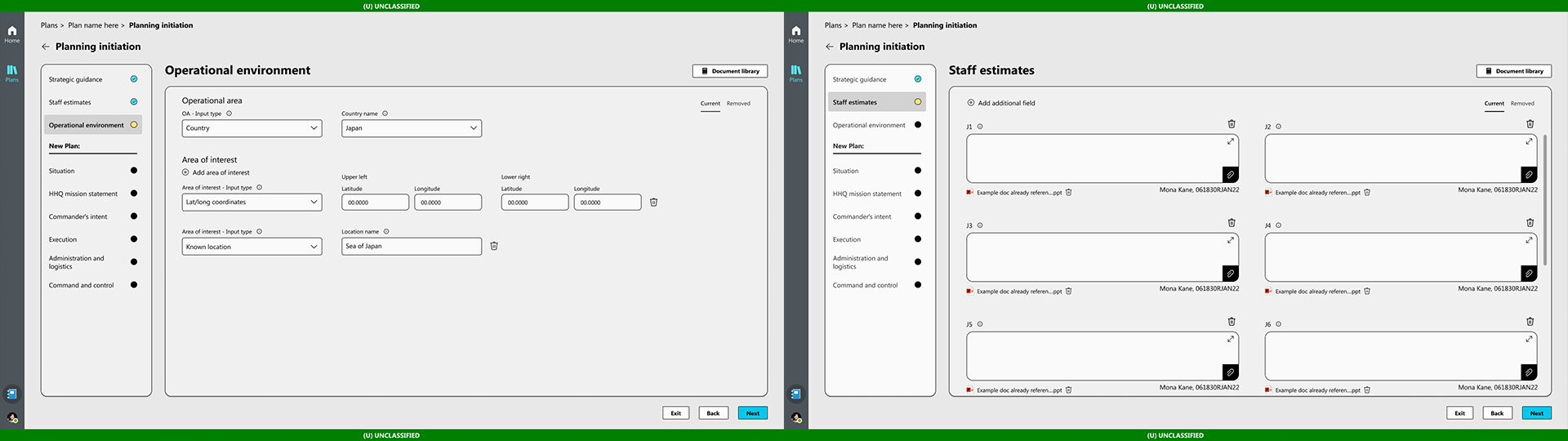
We tested with Subject Matter Experts multiple times each week, using early wireframes to confirm that the right information and decision points were present before evolving the experience into more fully populated designs.